
The Challenge
My Role
Timeline
Initially this was supposed to be a smaller project but it turned into something bigger and better. For the new idea we gave ourselves 6 months to finish the MVP with a 2 month buffer to make sure all research is complete and the product is ready for rollout.
Team
The team consisted of the Product Owner, a Developer and me as the UX Designer. I was in charge of all thing UX Design and Research and facilitating discovery.
Tools
-
Figma
-
Mural
-
Zoom Interviews & Testing
-
Optimal Workshop
-
Excel
Why do we need this product
Teaching life skills to children is difficult. It takes time, effort and patience and can be a frustrating experience when children don't want to listen.
Schools don't typically teach life skills and parents often don't know the best ways to teach these things.
The result of this problem is children are growing up without practicing character building life skills that they need as an adult.
The Proposed Solution
The Shining Sprouts team approached me with their idea to have YouTube channels where kids would teach other kids life skills. They had a video component paired with a PDF for the lessons and they wanted all videos to be available on YouTube for free, the PDFs would be included for a subscription fee. They just needed a marketing website to advertise the lessons.
The following case study explains my process of seeking to find the best solution and how this original idea evolved into something great.
How will we know it works?
After this product is on the market, we want to know if it's mission is working. We plan on doing testing before the product goes to market, but we won't really know if it's solving the real problem until people start using it. In order to get this feedback we will be doing some different marketing campaigns to offer incentives for data throughout the year. We also plan on adding a rating modal that will periodically ask students to rate their experience after taking a lesson.

Discovery
Target Market User Interviews
After going through a project brief and learning about the current plan for the product, I suggested we do some interviews to see what potential customers really need, how they're currently solving this problem of teaching kids life skills, what their pain points are and what would make their lives easier and why. I wanted to validate if this product was needed and if the original idea of just having YouTube channels was the best approach.
Affinity Mapping Workshop
After interviewing 10 potential customers, I presented the results to the team and took them through an affinity mapping exercise on Mural to start getting all of our ideas out on virtual paper and grouped in categories. This helped us get a start on the information architecture of the website while also talking through the product ideas to come up with the best solution.

Major discovery from interviews:
Parents don't feel safe letting their kids watch YouTube and would not purchase something that relied primarily on a YouTube channel.
What we changed:
We should embed all videos for children which would be accessed through a dashboard. So I was now tasked with creating both a marketing website and a dashboard for the video lessons and tools that help with parenting.
Personas
Based on the interviews and what we know about our target audience, we came up with two personas: a busy, working mom and a homeschool mom. Their needs are very similar but slightly different as homeschool moms already are teaching their kids regular school and might not feel they need another learning program. We are still considering the homeschool mom as a target market because they do still struggle with finding the right sources for life skills learning and they might just need to hear a different message in the marketing.


Design
Process Flows
I mapped out some quick user flows in Mural for the team to visualize how the user might get from point A to point B throughout the website and dashboard experience. But because the team is made up of all visual learners, the user flow actually wasn't visual enough to really get the quality feedback I was looking for. They really needed to see more detail at this point. So I sketched and created detailed wireframe flows to present to the team.
I went from presenting this visual

To Wireframe Flows
(to help stakeholders visualize and come to a better understanding)


Testing
Limitations
I had $0 for a research and testing budget but I knew this product could really benefit from research and testing, especially since it is a brand new concept. So I had to get creative. All interviews, usability tests and cognitive walk-throughs were done with friends of the company partners and with free platforms. Since these resources were limited, I really had to make sure we were using them at the right time, so I wasn't able to get as many people as I would have liked to participate. More testing and analytics will show in time what needs more iteration, but for now we did get some really helpful feedback and ideas from the people we were able to talk to.
Information Architecture Testing
I wanted to test some of our choices on the layout of the website and the dashboards before adding a higher fidelity, so I used the free version of Optimal Workshop to do some tree testing. In a perfect world I would have re-tested after making changes, but with limited resources I decided to just test the changes in usability testing of a mid-fidelity prototype later.
The team was also having a hard time deciding how to categorize the lessons at this point, so I suggested trying a card sort to see if it brought any clarity on how to group the lessons. I had the team write out a list of words they thought would describe the lessons. Then I recruited some friends and asked them to group the words into categories and name those categories, also using Optimal Workshop.
Card Sort
The card sort gave us an idea of how most of the words could fit into 2 categories. We decided to name those categories: Character Virtues and Life Skills. We could do a closed card sort to validate these names but with no research budget and limited participants, we decided to save our resources and table that idea for now. We plan on obtaining more information in usability testing and cognitive walk-throughs.

This card sort revealed 2 Categories = Character Virtues and Life Skills
Site Map Sketches


The information architecture in these site map sketches were tested with tree tests
Tree Test Key Insights

This Pie Tree diagram shows 7/10 participants failed and went to the website instead of the dashboard


Main changes after tree testing
-
Parents now have a different dashboard view than the child's version.
-
The parent's dashboard now displays the child's progress in a snapshot.
-
The parents have their parenting resources both on their dashboard for parents who are already subscribers but also on the website to attract new members.
-
The parents can submit Facebook Live questions via their dashboard or from the website, however if they click on the link on the website they will be prompted to log-in to their dashboard.
Before
After


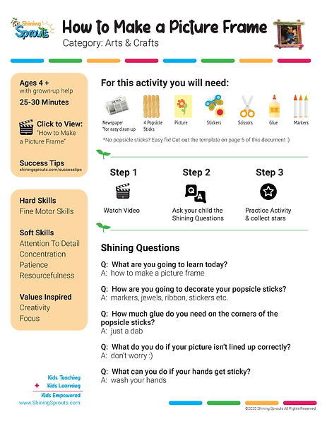
Usability Testing on a Lesson (Video + PDF)
While I was working on the website and dashboards, the founders were diligently shooting videos and creating PDFs to go with them. They wanted to get some feedback on the structure of the videos and PDFs and just see how people responded to the lessons overall. So I suggested doing some usability testing. I'm remote so I had the team set up sessions of children doing the lessons with a parent, while I watched on Zoom and the rest of the team took notes from the back of the room.
Before
After

Most notable finding:
The founders wanted the videos to always be free, PDFs would be the only difference in the paid subscription.
After the test I had participants assign value ratings to each component to see what they thought was most valuable.
= PDFs ranked least valuable and videos most valuable
We determined it wouldn't hold enough worth for someone to purchase a subscription just to get PDFs. We decided to have free samples the users could try but the subscription would be paid.
Cognitive Walkthroughs to Test a Prototype
I created a mid-fidelity prototype of the two dashboards and the marketing website and had participants think out loud as they went through each screen. I also gave them tasks so I could verify if my changes from earlier information architecture testing were accurate.
Usability Test Results Data
Child's Dashboard
*Before & After Testing

Before

After
Parent's Dashboard
*Before & After Testing

Before

After
Deliver
Final Solution &
Hi-Fi Responsive Screens
*Click View Prototype to see all of the screens including shop flows

Parent Dashboard

Child Dashboard
Marketing Website
Home Page

About Us Page
